
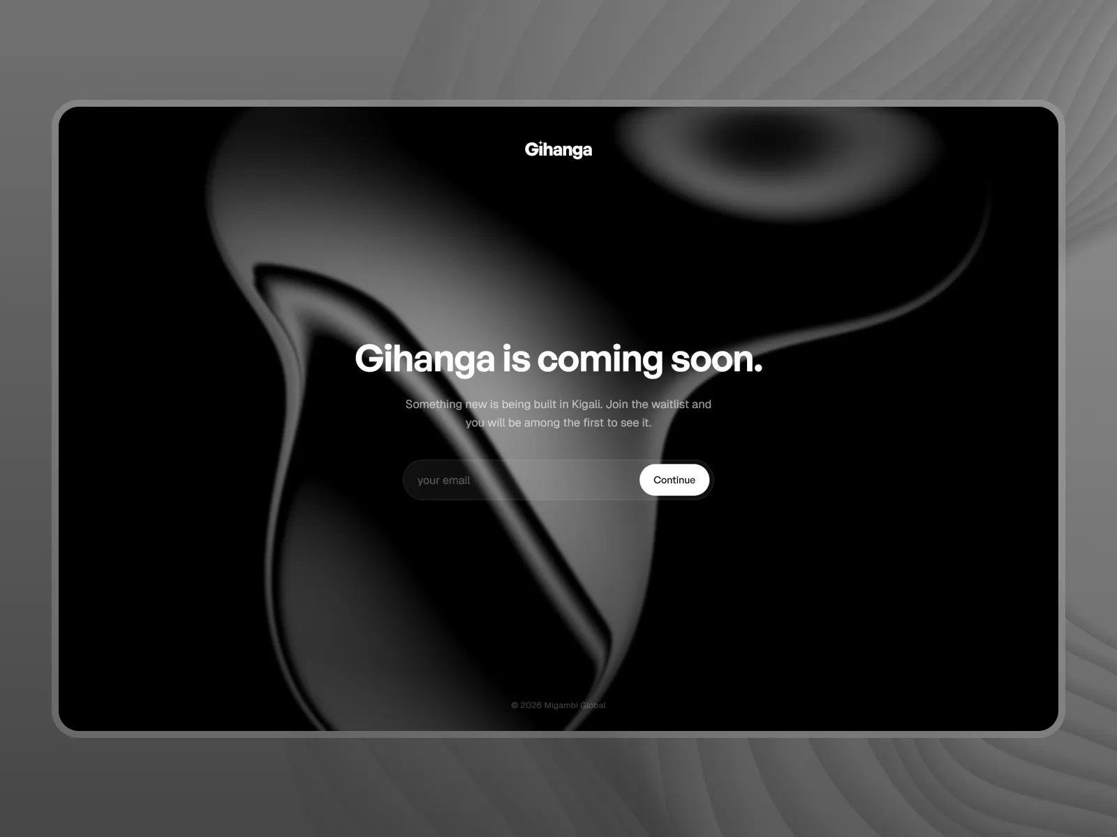
Gihanga AI
A new artificial intelligence product currently in development.
Rwanda
The most expensive design mistakes are not visual. They are structural: a navigation model that does not match how people think about their work, a flow that assumes information the user does not have yet, a screen that exists because a stakeholder asked for it.
We spend the early part of a project on those questions, because they are cheap to change in a prototype and ruinous to change in production.
We test with something clickable before anything is polished. An interactive prototype in front of five real users will tell you more than a month of internal debate, and it will tell you in a week.
What we are looking for is not whether people like it. It is where they hesitate, what they expect to happen that does not, and which words they read differently from how we meant them.
A design system is a maintenance strategy, and like any strategy it can be overbuilt. For a growing product, we define tokens, core components, and the rules for combining them, documented well enough that a new designer or engineer can extend it correctly. For a small site, we define far less, on purpose.
Most interfaces are designed for the moment everything works. Real software spends a lot of its life in the other states: empty, loading, partial, failed, offline, and permission-denied.
We design those explicitly. It is the difference between software that feels solid and software that feels like a demo.
Yes. Plenty of our design work is handed to an in-house engineering team or another studio. In that case the handover is the deliverable: a documented design system, specified states and edge cases, and a walkthrough with the engineers who will build it.
Both, and the research is what makes the interface design worth anything. For most projects that means a short round of interviews with real users, a review of whatever analytics and support tickets already exist, and usability testing on the prototype before it is built.
It is the shared vocabulary of a product: colour, type, spacing, and components, defined once and used everywhere, with the rules written down. You need one when more than a couple of people are making interface decisions, or when the product will keep growing after launch. For a single small marketing site, you do not.
In the same file and the same language. We specify states, breakpoints, empty and error cases, and motion, rather than handing over a picture of the happy path and letting engineers guess at the rest.
Then we work inside it. We extend an existing brand into a product interface, which is a different discipline from creating one, and we flag honestly where the brand will not survive contact with a dense interface.
Related work
A new artificial intelligence product currently in development.
Rwanda
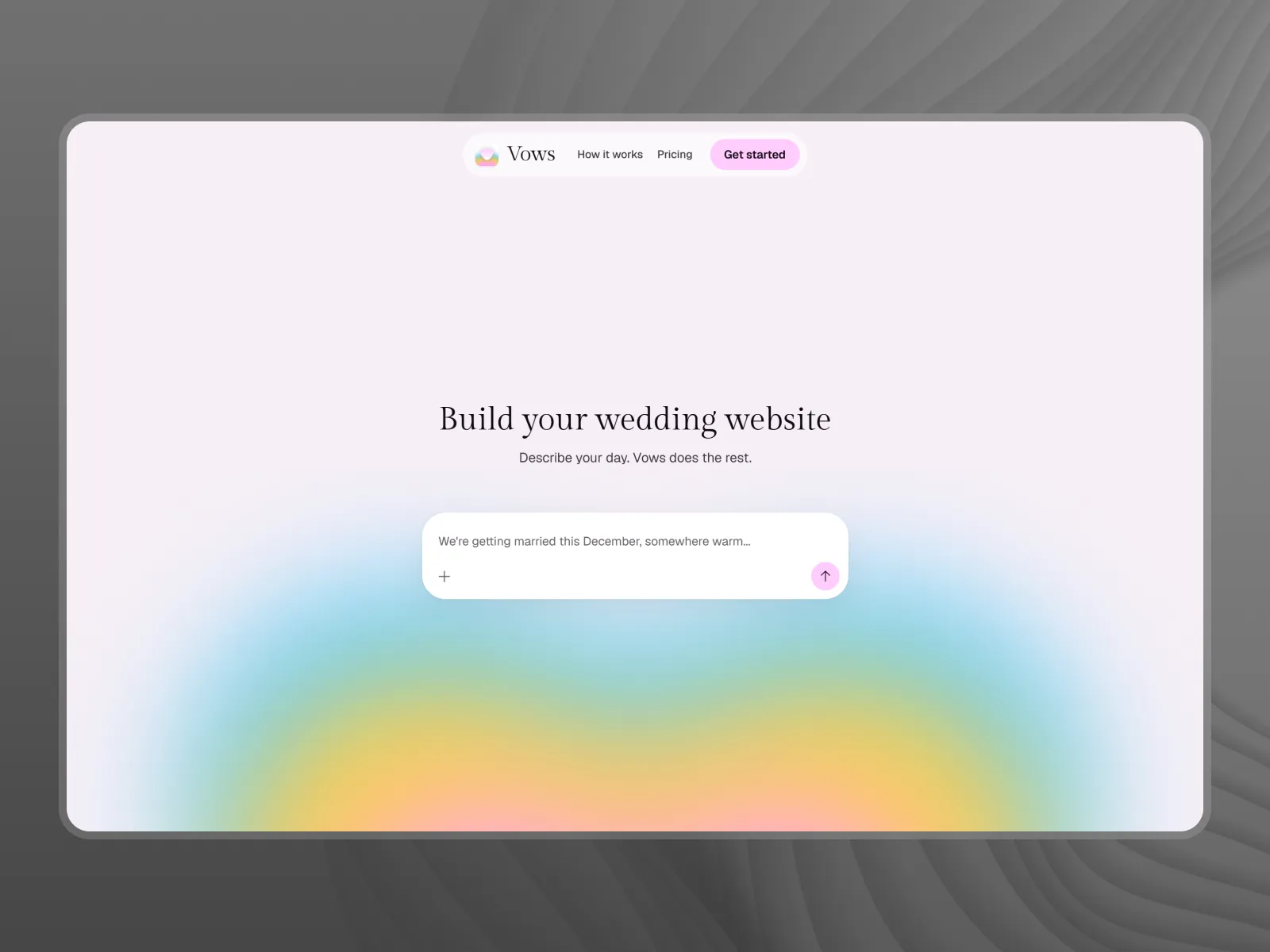
A wedding website you build by describing it. Couples write about their day in plain language and the site writes itself, on its own address.
United States
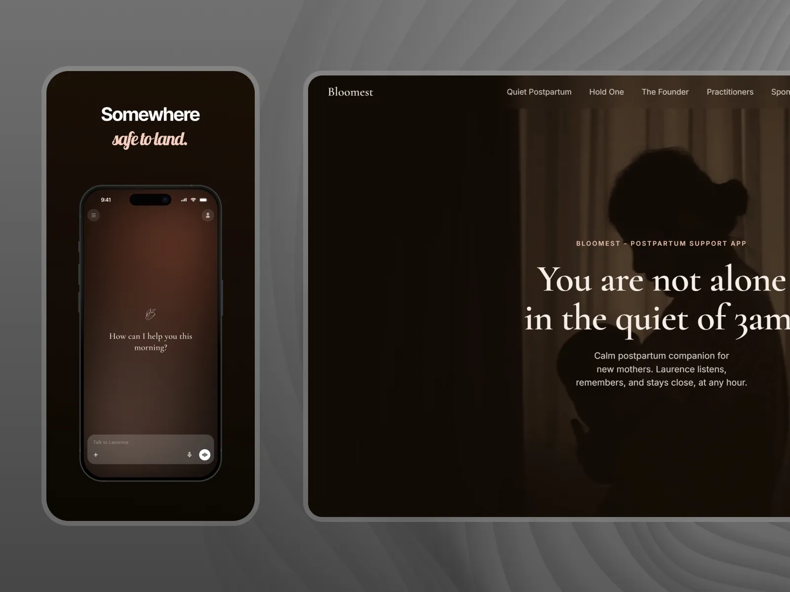
A postpartum companion app for new mothers, built around a voice presence rather than a tracker. Available on iOS and Android in 30 languages.
Canada
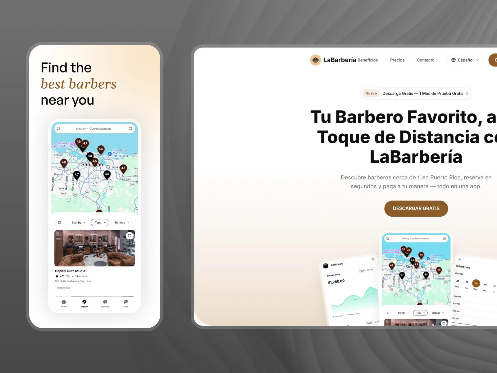
A two-sided booking marketplace for barbers in Puerto Rico, with real-time availability, direct payouts, and a $1 booking fee instead of a commission.
Puerto Rico
Tell us what you're working on. We'll tell you how we'd make it real.
Start a project